A bespoke, polished data science dashboard can be a beautiful thing for anyone looking to make data-driven decisions. And yet, not every project can afford setting up elaborate dashboards that cost money and developer time.
A bespoke, polished data science dashboard can be a beautiful thing for anyone looking to make data-driven decisions. And yet, not every project can afford setting up elaborate dashboards that cost money and developer time.
In this post, we show you how to construct a quick dashboard using Panel & Python without ever leaving the comfort of your Jupyter notebook. Before you start, download the demonstration video.
For this example, we want to create a dynamic plot dashboard displaying historical trends of popular (user-supplied) baby names.
While the historical trends of name registrations are not at the forefront of business decisions, similar name-indexed data queries could involve stock indexes, product names in your catalog (or a competitor’s), or perhaps predictions of future trends for your named-apparel business.
This baby-name data originally comes from the US Social Security open data; we have modified it for ease of use and to off-load some pre-processing needed for the final plots.
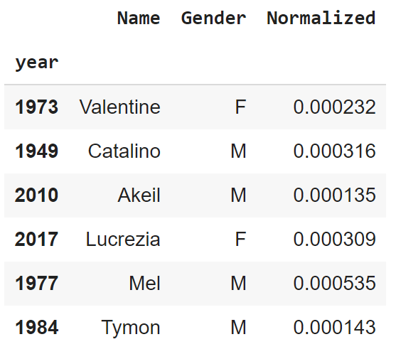
For each observation, we have preserved Year, Name, and Gender as features from the original data. We also have a feature Normalized that represents the percentage of all names within a given year.
We could add names common to M & F genders—say Dillon (M) & Dillon (F)—but we leave them distinct here to preserve their individual trends.
We present a random slice of the data below to build intuition.
					from IPython.core.display import display, HTML
display(HTML("<style>.container { width:90% !important; }</style>"))

import pandas
import hvplot.pandas
import panel

df = pandas.read_csv("SSNames.csv")
df = df.set_index("index")
df.index.name = "year"
left_panel_width=300

panel.extension() #this call is neccessary to make panel behave inside jupyter
df.sample(10)
With our data in hand, we first want to define a plotter function. This function produces plots of historical trends of registered baby names over a range of years with certain scalings (all user-specified). If you’re unfamiliar with Python, it’s enough to simply say that this function produces the plot we want without any interactive components. Without Panel, you can invoke this function yourself to generate plots in Jupyter using different input values supplied by hand.
					def plotter(names_list, names_list2, years, scale, scale2):

    ################
    # Input cleaning
    # Handles empty input(s), cleans format/capitalization for matching, builds lists

    if len(names_list) == 0:
        names_list = "No"
        names_list_f = "No"
    else:
        names_list_f = [x.strip().capitalize() for x in names_list.split(",")]
    if len(names_list2) == 0:
        names_list2 = "No"
        names_list2_f = "No"
    else:
        names_list2_f = [x.strip().capitalize() for x in names_list2.split(",")]

    ###############
    # Dataframe re-configure based on names input
    # source used as preliminary dataframe stripped down to only input names,
    # names converted to 'name (F/M)'

    test_frames = df[
        df["Name"].map(lambda x: x in names_list_f) & (df["Gender"] == "M")
    ]
    test_frames2 = df[
        df["Name"].map(lambda x: x in names_list2_f) & (df["Gender"] == "F")
    ]

    frames = pandas.concat([test_frames, test_frames2])
    frames["NameG"] = frames.apply(
        lambda x: x["Name"] + " (" + x["Gender"] + ")", axis=1
    )
    frames.drop(["Gender", "Name"], inplace=True, axis=1)
    frames.index.name = "year"

    listed_names = [i for i in pandas.DataFrame(frames.groupby("NameG"))[0]]

    source = (
        frames[frames["NameG"] == names_list[0]]
        .drop(["NameG", "Normalized"], axis=1)
        .join(
            [
                frames.groupby("NameG")
                .get_group(i)
                .rename({"Normalized": i}, axis=1)
                .drop("NameG", axis=1)
                for i in listed_names
            ],
            how="outer",
        )
    )
    source = source.fillna(0)

    ###############
    # Conditional axis labeling based on optional checkboxes
    # modifies data in source dataframe by optional metric(s)
    # finally, returns hvplot objects that contain our final plots

    label = "% of All Names"

    if scale:
        averages = source.join(yearly_average, how="outer")
        for i in listed_names:
            source[i] = averages[i] / averages["Normalized"]
        label = "% of Names / Yearly-Average"
    if scale2:
        averages2 = source.join(yearly_unique, how="outer")
        for i in listed_names:
            source[i] = averages2[i] * averages2["Normalized"] / 100000
        if scale:
            label = "(% of Names / Yearly-Average) * Yearly-Uniques / 10^5"
        else:
            label = "% of Names * Yearly-Uniques / 10^5"
    if "No (F)" in listed_names:
        listed_names.remove("No (F)")
    if "No (M)" in listed_names:
        listed_names.remove("No (M)")
    to_plot = source[(source.index >= years[0]) & (source.index <= years[1])]

    return to_plot.hvplot(
        x="year",
        y=(listed_names),
        alpha=0.04,
        kind="area",
        legend="top_left",
        height=400,
        width=800,
        value_label=label,
    ) * to_plot.hvplot(
        x="year",
        y=(listed_names),
        kind="line",
        legend="top_left",
        height=400,
        width=800,
        value_label=label,
    ).opts(
        toolbar=None
    )
If calling plotter itself were enough, we’d be done. In this case, we want to share a plotting tool with a boss or friends. This means we want some interactive elements for our dashboard: widgets.
Widgets are often the basic building blocks of a Panel dashboard. These components are familiar to anyone who has seen web forms previously. For the use-case here, we need only three types of Panel widget: TextInput (to enter names), a RangeSlider (to select the years to plot), and Checkbox (to toggle optional metrics).
					tickers_male = panel.widgets.TextInput(
    name="Names (M)",
    value="Andrew",
    placeholder="Enter Names Here",
    width=left_panel_width,
    margin=(100, 30, 0, 10),
)

tickers_female = panel.widgets.TextInput(
    name="Names (F)", placeholder="Enter Names Here", width=left_panel_width
)
tickers_female.value = (
    "Sarah"  # Alternative default value in original widget declaration
)

years_range = panel.widgets.RangeSlider(
    name="Years",
    start=1880,
    end=2018,
    value=(1880, 2018),
    step=1.0,
    width=left_panel_width,
)

checkbox_year = panel.widgets.Checkbox(name="Scale by Yearly Average")
checkbox_nunique = panel.widgets.Checkbox(name="Scale by Yearly Unique Name Entries")

yearly_average = df.reset_index().groupby("year").mean()

# This metric double-counts names both in M and F categories;
# a careful analysis might want to split them up.
yearly_unique = (
    df.reset_index().groupby("year").count()["Normalized"]
)
The function panel.interact makes it straightforward to connect the plotter function with the preceding widgets. We simply supply the function (plotter) as the first input argument to panel.interact. The remaining input arguments associate widgets with plotter‘s input arguments. Be certain that the widget output data types match with plotter‘s requirements. For example, the input years should be a (sorted) list or tuple of two distinct integers; a RangeSlider with specified values for start & stop provides a valid tuple.
Panel also enables arranging elements of your dashboard with Row and Column objects. For instance, below, dashboard[0] contains all the input widgets, while dashboard[1] is the output of the plotter.
The addition of .servable() to your panel layout allows the entire notebook to be called by
$ panel serve <Notebook-Path
from the command line (provided you have Panel installed). This allows multiple clients to connect to this service via web browsers.
					interact = panel.interact(
    plotter,
    names_list=tickers_male,
    names_list2=tickers_female,
    years=years_range,
    scale=checkbox_year,
    scale2=checkbox_nunique,
)

html_pane = panel.pane.HTML(
    """<h2 style="text-align:Center">Social Security Names Plotter</h2>""",
    sizing_mode="stretch_width",
)
html_pane2 = panel.pane.HTML(
    """<h4 style="text-align:Center">Names are not case-sensitive, and should be entered like: Andrew, Dillon, Travis <br><br> Hit enter in text field to re-render</h4>""",
    sizing_mode="stretch_width",
)

panel.Row(
    panel.Column(interact[0], html_pane2),
    panel.Column(html_pane, interact[1]),
).servable()
There you have it—a quick and easy option for dashbording without breaking a sweat. That’s not all that Panel can do, but for a simple framework for getting a UI wrapped around your functions, it’s hard to beat.
Here is a link to the Binder for running this notebook.
Here is the data for this exercise.